D e s t r e s s i f y.
In a world where no one is getting enough sleep, Destressify aims to help users destress in a gamified way by writing their thoughts, organizing them, and turning them into actions.

The problem
Visual Destresser is an app that helps people to destress by showing them how to visually declutter their minds in a gamified way so that they feel incentivized to destress. Because this app relies so heavily on visuals, my big challenge was to make sure that the mental metaphor of putting thoughts into boxes (one of the key parts of the app) made sense to people.
The solution
I focused on a user-centered approach, focusing on diary studies, interviews, and personas to create a prototype that saw two rounds of user testing. This ensured that user comprehension was at the forefront of the process.
My role
For this project, I was the sole UX designer and wore all the hats: I conducted user research, created wireframes, and conducted user testing during the product’s development.
RESEARCH PHASE: Sleep, Interrupted
When I originally set out to create this app, I was investigating the link between noise and sleep. I was living in a tiny NYC apartment with 3 roommates above a noisy bar, at a busy street intersection that saw at least one head-on car crash a month. Needless to say, I never slept.
Diary Studies & Interviews
I conducted a series of diary studies and remote interviews, to see how noise affects sleep, and I was somewhat surprised by what I found: sometimes it did; sometimes it didn’t.


Already, my hypothesis was being subverted.
So I pivoted my focus: what WERE the factors that were causing people to sleep poorly?
Affinity Maps
I synthesized all my notes into an affinity map to see if there were other patterns I could find instead. The biggest themes I found participants shared were lack of awareness around sleep hygiene, having poor boundaries between work and home life, and being generally stressed.


Empathy Maps & Personas
Based on my research, I developed an empathy map and persona who exemplified most of the traits my interviewees had in common: young people who lived in a big city and were stressed, busy, and dedicated to their jobs. Thus was born Jennifer Lee, a 30 year old marketing manager who lives in New York City and is a workaholic who knows she needs better sleep but can never quite figure it out.


How Might We…?
So my initial question that I was looking to solve was How Might We help Jennifer sleep better? How might we help people sleep better? But later on, that “how might we” question would change.
SKETCHES PHASE: An App is Born
My first iterations were lofty and varied in an attempt to solve the sleep crisis. Some of the ideas I came up with were a sleep checklist, a voice assistant-guided wind down, gamified visual stress organizer, visual circadian rhythm estimator, and a virtual reality headset for bed.


For the purposes of the Springboard course, I eliminated the voice assistant wind down and the virtual reality headset, since both were outside the scope of this class.
User Story Map & Minimum Viable Product
When I set out to create a user story map with a minimum viable product for the app, I began getting a little ambitious and wondered if there was a way I could combine the remaining three ideas into an app.

Site Maps & Red Routes
The three features within the MVP developed into three distinct red routes: establishing daily habits, destressing a la minute, and preparing for bed.


Or beginning of the day, middle of the day, and end of the day, respectively.
The sleep checklist was divided into the beginning of the day and end of the day red routes, while the visual stress organizer and the visual circadian rhythm estimator were folded under the “throughout the day” red route. Unfortunately for my app (but fortunately for my personal health), it was around that time that my mentor informed me that a visual circadian rhythm estimator already existed! I quit working on that portion of the app and downloaded it myself!
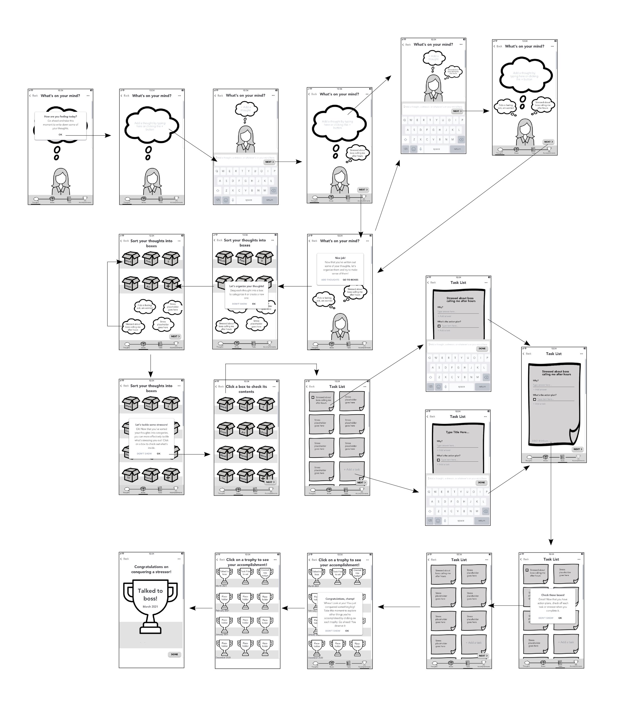
WIREFRAMES PHASE: International Sleeper’s Anthem (I Choose You, Red Route 2)
As I sketched out the first screens for my three red routes, I narrowed in on the one that I felt could make the most overall impact: the visual stress organizer.

Guerilla Testing
After guerilla testing my first paper prototype, I was disappointed to learn that not only did people not understand the mental model of the app—they didn’t know how to use it at all.
With that in mind, I focused my energy on a single aspect of the red route—the visual stress organizer— and created digital, black-and-white wireframes with better verbiage, more visual context, and emphasized how the different stages of the red route were connected together in a process.
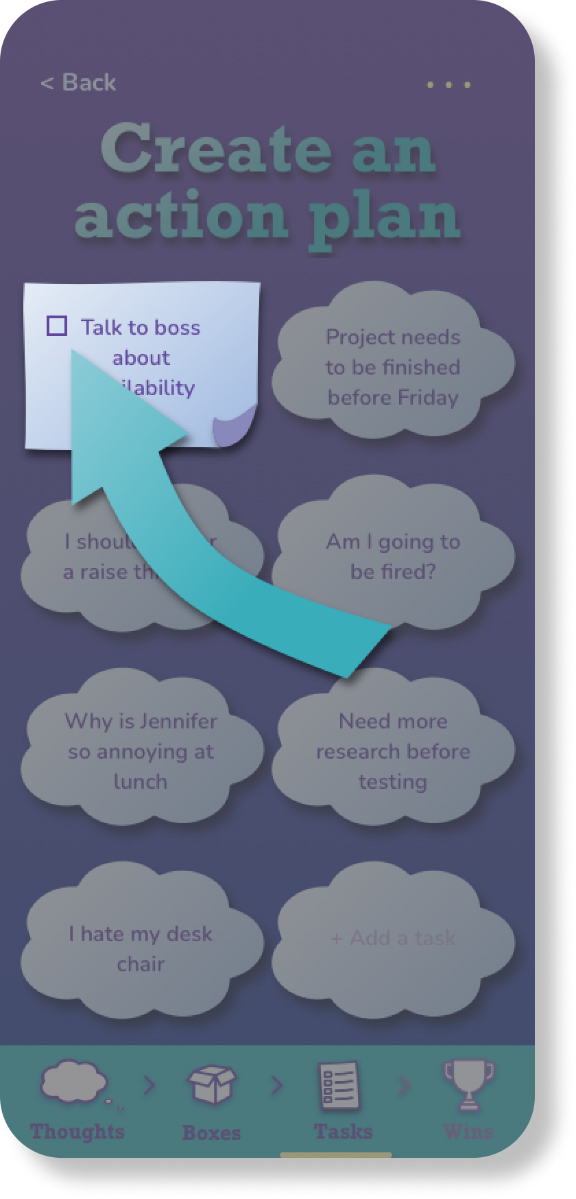
PROTOTYPE PHASE: big mood, big style
Mood Board & Style Guide
To create my first fleshed-out, color prototype, I created a mood board and style guide to fit the theme of the app. The keywords were fun, friendly, and relaxed.
For the color scheme, I chose an analogous palette of blue, purple, and green, since studies show that these colors indicate relaxation, calm, and trust.
Studies also show that sans serif fonts with a wide x-width and curved edges give off a friendly vibe, so I chose Nunito as my main font. As an accent font, I chose Rockwell, a fun, slab serif font that also had a wide x-width.
All buttons and modal boxes were rectangles with rounded corners, and the background was a soft blue to purple gradient to replicate a relaxing night sky.


While I mocked up my first round of high-fidelity screens in Sketch, I found myself using the gradient and soft drop shadows more and more. These design decisions created a more three-dimensional world within the app and reinforced the idea of the mental model.


After a fortnight or so of fleshing out a full prototype for my red route, I was ready to conduct the first round of usability testing on the app.
USABILITY TESTING PHASE ONE: What’s in the Box?
The main thing I was worried about during phase 1 of testing was that people would still not get the concept of the “boxes”—what they were, what to do with it, and what their connection was to destressing. So for the first round, I put my hypothesis to the test.
I conducted 4 remote, moderated usability tests with participants 24-35 years old in New York City found via social media. My goals of this round of testing were:
See if users understood the mental model of organizing their thoughts into boxes
Uncover usability problems along the red route
What I discovered is that a good number of people DID understand the concept of the boxes but there were still a handful that didn’t understand the concept until much later in the red route. I fixed this by adding more visual guidance via arrows and grayed out screens so that users would always know what was the next step.

One issue that became apparent that took me by surprise was that some users weren’t following the process in a linear order. These users explored around the app using the bottom navigation, throwing off their comprehension of the app and its process completely. In order to solve this issue, I clarified the navigation bar by adding arrows in between icons to signal a direction the user should be following (like in shopping carts), and emphasized which part of the app they were on by adding a drop shadow and making other sections lower contrast.


TO THE FUTURE & BEYOND
While I was working on the app, I was very ambitious with what I wanted to accomplish, even though this was just a class project and I had limited resources. For example, I combined 3 different red routes into one app before realizing I had to pare down and focus on one. In hindsight, it would have behooved me to focus my resources and energy on one red route that would have been enough to solve the user problem.